Tuesday, September 12, 2023

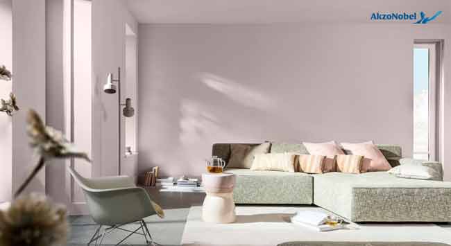
Inspired by soft feathers and evening clouds tranquil beauty, AkzoNobel introduces ‘Sweet Embrace’, the Colour of the Year 2024. If any colour could give a home a hug, it’s Sweet Embrace, AkzoNobel’s Colour of the Year 2024. The pastel pink shade, inspired by soft feathers and evening clouds, is perfect for creating the calm and welcoming spaces so many craves for.
“It’s a tranquil, welcoming shade that meets every need for stability and a feeling of belonging. It works equally well alone or with hues from three complementary colour palettes, allowing one to create the perfect “special somewhere”.”
This welcoming colour reflects extensive research into global social, design and consumer trends for 2024 which found that, in an uncertain world, everyone’s on a quest to belong. The need places that make everyone feel calm, and one also seek moments of joy in everyday experiences. Identified by in-house paints and coatings colour experts and international design professionals, these three trends will influence how we live in the coming year.
“With society in a state of flux, we’re reassessing how we cope with the world,” says Heleen van Gent, Creative Director of AkzoNobel’s Global Aesthetic Center. “Starting at home, we’re looking to create our own ‘special somewhere’ that grounds us in our individual memories and relationships. Our Colour of the Year, Sweet Embrace, and its three complementary color palettes can help us achieve that. They enable us to personalize our environments to fit the times we live in, as well as bringing a sense of stability and moments of joy to our spaces.”
As part of the 2024 ColourFutures colour trend report, three decorative paint color stories have been designed around Sweet Embrace to help consumers choose on-trend and harmonious wall colors that reflect their unique personalities. The warm color story reminds you of home, a place that feels comfortable and safe, and combines shades of stone, soil and clay. The calm color story evokes thoughts of nature and the essence of life, bringing together the soft greens and blues of the woods and sea. Lastly, our uplifting color palette puts a smile on your face with dreamy lilacs and modern yellows.
On-trend colors, textures and special effects have been designed for the aerospace, automotive, consumer electronics, metal furniture, lighting, cabinetry, flooring, building products and architecture markets, as well as decorative paints.
“Color of the Year often inspires long-term design partnerships in our businesses,” says Jan-Piet van Kesteren, Business Unit Director for Decorative Paints in Europe, Middle East and Africa. “We combine consumer trend insights with in-depth color and materials research and market analysis in our ColorSurfaces trend collection to bring market-specific solutions to our customers and work together with them on the perfect finish for their projects.”
Tags: AkzoNobel, paint, wood, wood and panel, woodworking, woodworking and manufacturing, woodworking and processing, woodworking industry, woodworking UK
Comments: